5 Essential Principles For Pet Industry Website Conversion & Revenue Increases
Want to know the number one factor to increase website conversion rates for pet product websites? Using photography that humanizes the pet. Today's blog post is a guest post from Tim Brown. Tim has extensive experience working on pet product websites and in this post her shares what he has learned. Need help with your website? Profitworks provides marketing services specializing in search engine optimization and website conversion optimization services. We Work. You Profit.
Executive Summary
Tip #1 - Focus on humanizing the pet through the pictures you use on your website
Tip #2 - Focus on writing website copy as if you are writing to one pet owner
Tip #3 - Boil down the main action you want a website visitor to take to one call-to-action button
Tip #4 - Feature answers to common questions and have a phone number available on all pages
Tip #5 - Create iconographic visual indicators of key differentiators your product has and highlight reviews and testimonials of your pet product
Focus On Humanizing The Pet Through The Pictures You Use On Your Website
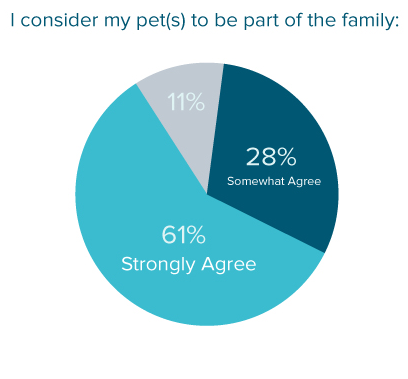
Focus on humanizing the pet through the pictures you use as according to PackagedFacts when posed with whether they agreed with “I consider my pet(s) to be part of the family," 61% strongly agreed and 28% somewhat agreed. Almost two-thirds of all pet-owners view their dog or cat as their best friend; pet owners are spending more time with their pet, and actually really enjoy buying products to pamper their pets.”

Example of bad pet photography - Seen from above / Non humanized
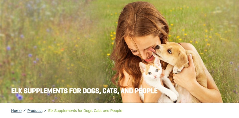
Example of Good Pet Photography - Pets are regarded as family
Focus On Writing Website Copy As If You Are Writing To One Pet Owner
Make it feel personalized. In Scientific Advertising, Claude Hopkins says “Don’t think of people in the mass. That gives you a blurred view.” Though it was written in 1923, it still rings true today and no less in the Pet industry than other places as people have a deeply personal relationship with their pets.
OK Copy: “Get your pets in for a checkup. Every dog should see a vet at least once a year”
Better, More personalized Copy: “You care about your pet and so do we, we know your dog or cat should be in at least once a year and we’re there to help so you can have a healthy pet and peace of mind.”
How To craft effective copy:
1. Pretend your ideal pet owner is sitting right in front of you.
2. Write copy in a way that would sound natural your ideal pet owner and has an emotional hook and a clear value proposition for them.
3. Read it out loud and make sure it would sound natural in conversation.
Boil Down The Main Action You Want A Website Visitor To Take To One Call-To-Action Button
Lack of hierarchy forces users to think too much of what they should choose to interact with first. So don’t try to stuff too much in to your pet product categories and product pages - If you have secondary call-to-action’s like leaving reviews, or asking visitors to like the company on social media make sure they are not as prominent by a long shot. On the homepage the main call to action should invite them to shop in the case of an Ecommerce site, and the ‘Add to cart’ button should be bright, contrasting, and overall much more prominent than all of the other elements on the page.
Less Effective Example = many call to actions on home page - What’s the obvious next step? (Bravo Pet Food)
More Effective Example = clear next step Call to action (Wapti Labs Inc.)

Feature Answers To Common Questions And have a Phone Number Available On All Pages
FAQ
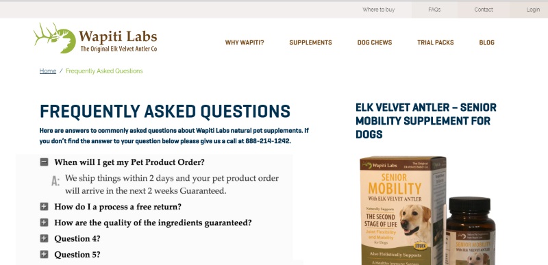
This doesn’t need to be in the form of some ridiculously long old-school FAQ’s page, you can use a section with Questions, and answers in a ‘Show/hide’ that allows a visitor to click or tap on the question they want answers to – opening them to show the answer, but without taking up a ton of space when they aren’t looking for answers.
Phone Number
The below chart shows an A/B test where the effectiveness of the page was measured based on whether or not the page had a visible phone number. In a test done on theflowr.com, 54.96% of conversions resulted from a page with a phone number versus only 46.04% of conversions coming from a page that did not have a phone number. If you add a phone number to all the pages on your pet product website you will see an increase in sales.
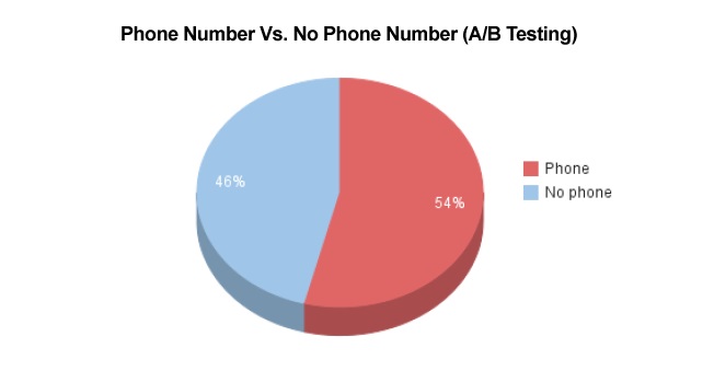
Test done on theflowr.com and published on the blog of KissMetrics
Create Iconographic Visual Indicators Of Key Differentiators Your Product Has And Highlight Reviews And Testimonials Of Your Pet Product
Whiskers to Tails Pet-sitting’s site is a great example of a strongly visual set of 3 icons that show the things that many of their current clients cite as why they chose them over the competition. It’s important to get to the bottom of this question first - so ask current clients or customers that question: “Why did you choose us over the competition” and make the top 3 answers into icons and featured elements for the home page.
You can always give a little more prominence to reviews and testimonials on product or service pages, but in this example you can see there’s a little ‘co-branding’ with Angie’s list and Google - showcasing the fact that the company is very well reviewed on these sites.
Altogether the magic of helping visitors turn into conversions on a pet site is strongly related to helping them trust you and showing what makes you so special, so it will be highly unique to your specific situation. Ask the right questions of your customers or clients and it will help you get to the bottom of these all important keys to presenting your story well online.
How To Create Trust With Pet Owners
Imagine you have 5 minutes to explain why you’re the best choice for their pet, and what’s different about your company from the next. What would you mention first? Maybe ‘I graduated from such and such, I’m accredited, and here are 5 people that really have enjoyed our product/service before.’
The same goes for explaining key differentiation and getting new possible customers or clients for your company:
-
Pet Industry Badges
-
Awards
-
Testimonials and Reviews
-
Social media sharing (like the company Wellness Pet Food - see their facebook page here)
The more you share in a clear and visual way, the more reason the pet owner customer will to trust the site and feel comfortable making a purchase.
Get A Free Review Of Your Website From One Of Our Website Conversion Experts
Complete With Our Top 5 Recommended Changes Specific To Your Website To Improve Sales
Profitworks Small Business Services provides website traffic, and website conversion optimization services which increase the number of sales generated from a website. The focus of our services is on increasing sales and providing a positive return on investment. We Work. You Profit. To learn more about Profitworks click here.
Thanks again to Tim Brown for writing this guest post. Tim Brown is a web designer and digital marketer for Snap Agency web design team focused on Ecommerce SEO, and Conversion Optimization.
Other Articles You Might Be Interested In
1. 4 Best Practice Marketing Design Rules
2. Creating A Marketing Strategy
