The #1 tip for for to craft captivating marketing graphics is to focus on clarity and simplicity to ensure your message is instantly understood.
In this article, you will learn about:
-
Getting Attention - How to create striking visuals that stop the scroll.
-
Why Good Design Is Everything in Marketing - The importance of memorable branding and visual storytelling.
-
The Many Benefits of Strong Marketing Graphics - Boost brand recognition, increase engagement, and drive conversions.
-
What Makes a Marketing Graphic Truly Effective? - Core design principles like simplicity, hierarchy, and emotional appeal.
-
How to Create Effective Marketing Graphics - Practical steps for designing impactful visuals.
-
Wrapping Up - Final thoughts on ensuring your graphics communicate effectively.
If you're a small to medium-sized business looking for help to craft captivating marketing graphics, contact Profitworks today!

1. Getting Attention
How many times have you experienced the following phenomenon: you're scrolling through your feed as you normally do, when a striking image or video stops you dead in your tracks; you abandon what you were doing (most likely, aimless doom-scrolling) and follow the link on said image or video. We can already guess: you've experienced it a handful of times, if that much.
You know how we know this? Because we know from first-hand experience how difficult it is to get someone's attention in this day and age, marked by increasingly loud digital noise. It's so difficult, in fact, that when it actually happens, you, as a marketer, feel like you've struck gold.
But what does it actually take to strike this marketing gold? More than anything, great marketing graphics.
Mind you, "great" visuals don't just look great – they persuade. In other words, they pull you in, communicate a message (sometimes in a second or less), and leave an impression that sticks. And this is true whether you're running ads, promoting a product, or building brand awareness: marketing graphics can be (and more often than not are) the difference between being ignored and making an impact.
So, the question is: what separates a design that gets attention and converts from one that fades into the background along with the rest? How do you create high-quality graphics that don’t just look professional but truly drive real results for your business?
2. Why Good Design Is Everything in Marketing
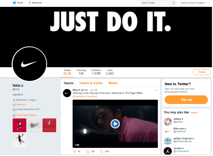
Take a moment to think about brands like Apple, Nike, or McDonald's; what was the first thing that came to your mind? We can bet it’s their logo, a.k.a. visual design. Yes, these brands are iconic, and so are their logos, but the point remains: the first thing that comes to your mind when you think of a big brand is a simple visual. Why is that? Because we all think in symbols.

If you think about it, it's all really simple: we automatically associate simple symbols with complex ideas because we process visuals much faster than text.
Hence why logos and branding elements carry so much weight in marketing, and why they need to be calculated and intentional (while appearing effortless). And when we say “intentional”, we mean exactly that: yes, good design looks nice, but more importantly, it communicates the message you or your brand is trying to get across. It also reinforces brand consistency and, in the end, persuades the viewer to take action.
Here's a fun fact for you that confirms everything we've talked about until now: the human brain processes images in as little as 13 milliseconds. That means a strong, well-designed graphic can tell a story before a single word is read. Talk about power!

Source: Tesla.com
But what's even more interesting about marketing visuals is that they can do what text alone can’t: create an emotional connection between the audience and your brand. A single powerful image can communicate a feeling, tell a story, or inspire action faster than paragraphs of copy.
Of course, branding isn’t just about logos. Every digital ad, social media post, email banner, and product package contributes to the overall perception of your business, so each segment requires thoughtful planning, as well as consistency.
The latter is especially important because it builds trust, and trust leads to customer loyalty. Research confirms this: according to a study by Lucidpress, businesses that maintain consistent branding see an average revenue increase of 33%.
3. The Many Benefits of Strong Marketing Graphics
We already mentioned that great marketing visuals won't just make your brand look good (cool, elegant, luxurious, etc., depending on your goal); it will have tangible benefits for your business. Below are just some of them.

Boosts Brand Recognition
When your marketing visuals are well-designed and consistent across the board (colors, fonts, and visual styles), they can make your brand more recognizable. This is simple logic: the more people see a familiar design, the more they remember you. Of course, this takes time, but it's important to get it right from the start - be intentional and be consistent with your marketing graphics.
Enhances Engagement
What are you more likely to share and click on: interesting, visually appealing content, or one that lacks images but is dense in text?
If you're anything like most people, it's the former. This is why you want really strong graphics in your marketing materials - they're more likely to be shared, liked, and commented on, all of which is necessary if you want to improve email open rates and drive website traffic.
Increases Conversions
The ultimate goal of marketing is (usually) to increase sales. And certain design elements in your marketing materials - like strong calls to action, well-placed product images, and eye-catching headlines - are absolutely essential for this task. When done well, they push viewers toward action, whether it’s buying, signing up, or engaging with your brand.
Builds Trust and Credibility
Do you want your business to signal credibility and trust? If yes, you need a professional, well-designed visual presence. It's non-negotiable. Of course, it takes more than just great marketing graphics for a brand to become synonymous with credibility - you also need positive customer reviews, and lots of them - but it's an important piece of the puzzle, nonetheless.
Why? Again, humans are visual creatures, so even if you have years of experience in your field and a ton of great reviews, if you use poor visuals in your marketing, most potential customers will question your legitimacy.
Simplifies Complex Messages
If you have a great product or a service but are not sure how to communicate its purpose clearly to the audience, turn to visual elements like infographics, charts, and icons.
They all make it easier and quicker to convey complex ideas, and unlike text-heavy explanations, they don't overwhelm the audience. With the right visual graphics, you can communicate key points in an easily digestible as well as visually engaging way.
4. What Makes a Marketing Graphic Truly Effective?
What Makes a Marketing Graphic Truly Effective?
Alright, now onto the juicy part: what exactly makes a graphic design effective, meaning, able to drive results (whatever they may be for you)?
First, let's acknowledge the fact that aesthetics matter. Of course, they do - after all, we've mentioned numerous times that people are visual creatures and when something looks good (whether that's another human being or an ad), we're more likely to pay attention to it. However, what matters even more is that the pretty visuals serve their purpose and drive an intended response.
Now, while design choices should align with your brand, product, and message, certain principles for creating effective marketing graphics apply across the board. Here they are.
Clarity and Simplicity
You want one simple (but in reality difficult) thing from your marketing graphics: to communicate a message fast. The latter is important because the average person gives an ad or social media post only a second or two before deciding whether to engage or scroll past. So how do you achieve this impossible task? With a simple but clear design.

Source: Pixabay
Simplicity is best because it ensures quick comprehension. Overly complex designs with too much text, excessive detail, or clashing colors, on the other hand, are likely to lose people before they even process your message. Why? Because it overwhelms rather than engages.
How to have clear and simple graphics:
- Use white space to avoid clutter and keep designs from feeling cramped.
- Stick to a single focal point, whether it's an image, logo, or main text.
- Avoid excessive fonts and colors; two to three complementary colors and a maximum of two fonts are ideal.
- Make sure the text is large enough to be legible at a glance.
Strong Visual Hierarchy
Good design guides the viewer’s eye toward the most important information, and this is not possible without a clear visual hierarchy. In fact, without it, key elements may get lost, reducing the effectiveness of your marketing, maybe even nullifying it.

Spotify Wrapped is effective because it offers personalized, shareable content that taps into users' emotions and sense of identity by celebrating their unique listening habits. Its interactive design, social media integration, and use of data storytelling create a sense of exclusivity and community, encouraging widespread sharing and brand engagement.
Speaking of key elements, it's also important to invest in high-resolution photos, vector graphics, and sharp typography. What if your budget is small and you're limited to stock images? Be extra cautious and picky because generic or overused visuals will just make you blend with the rest of the brands.
How to create strong hierarchy and ensure the effectiveness of your marketing visuals:
- Use size, color, and contrast to emphasize important elements.
- Place key information (like a call to action) in the most visually dominant area.
- Align elements purposefully to create a logical reading flow.
- Use only high-quality images and sharp typography that feel professional and polished.
Brand Consistency
Your marketing graphics should be unmistakably you. This is the consistency we talked about before - it matters, and greatly so, because it builds trust and recognition.
But how do you achieve this?
By sticking to a consistent color palette, typography, and visual style across all platforms. The goal is for a (potential) customer to recognize your content wherever they see it (whether on social media, a website, or a billboard) and instantly associate it with your company.
![]()
Here’s how you can do this:
- Use a defined color palette that complements or supports your message/makes sense for your brand.
- Make sure your typography is consistent across all materials.
- Have a cohesive visual style, whether through photography, illustrations, or iconography.
- Ensure that your logo is correctly placed and proportioned.
Emotional Appeal
Here’s the secret sauce to a compelling marketing strategy: appeal to human emotions, not reason.
Why?
Because we make decisions based on feelings, and then justify them with logic.
This is why the best marketing graphics tap into emotions, which can be anything from excitement to nostalgia to urgency, all the way to love and trust.
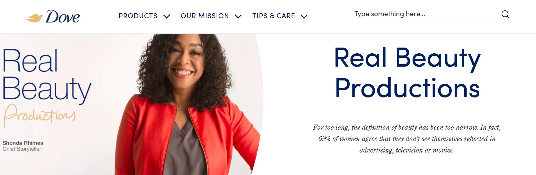
Source: Dove
An example of an emotionally appealing marketing graphic is Dove’s “Real Beauty” campaign. The graphics featured women of all shapes, sizes, and ethnicities, celebrating natural beauty and self-acceptance. The visuals evoke feelings of inclusivity, confidence, and self-love, encouraging viewers to redefine beauty standards and embrace their authentic selves, while strengthening Dove's message of empowerment and body positivity.
How to add emotional appeal to your marketing graphics:
- Choose images that resonate emotionally with your audience (happy customers, aspirational lifestyles, etc.).
- Use color psychology: red can create urgency, blue builds trust, and yellow evokes positivity.
- Pair strong visuals with emotionally compelling copy.
Readability and Accessibility
Beautiful, aesthetically pleasing, or simply pretty – call it whatever you want, but the way your marketing visuals look matters.
But – and this is a crucial but – what matters equally as much is that it’s easy to read or understand. Because the truth is, a beautiful design is pointless if people can’t read it (and yes, we do mean at a glance, which is what the average scroller will give to your ad).
This is why you need to make your visuals accessible to the widest audience possible, including those with visual impairments. So, fonts should be readable, on-brand, and suited to your message, and any visual elements should be simple and clear.
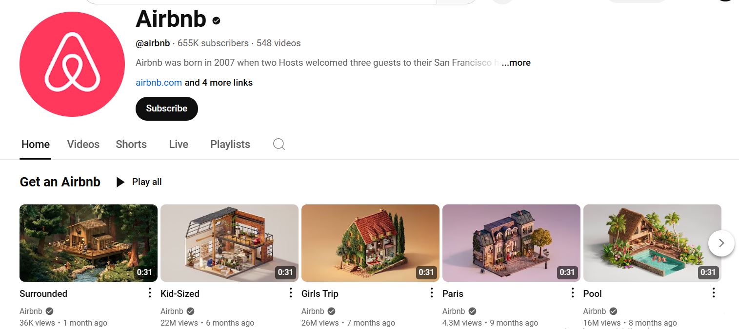
Source: https://www.youtube.com/airbnb
For example, Airbnb's ad campaigns often use simple, clean design with high-quality images and clear, legible fonts. The visuals are striking, with minimal clutter, and the text is easy to read even on mobile screens. The images evoke feelings of wanderlust and comfort, while the straightforward messaging ensures viewers can quickly grasp the idea — making it both visually appealing and effective in conveying the brand's message.
How to implement this tip:
- Use high-contrast color combinations to enhance legibility.
- Avoid using decorative fonts for large bodies of text.
- Test designs on different screen sizes and in grayscale to ensure clarity.
- Add alt text and captions for digital graphics to improve accessibility.
Call to Action (CTA)
Finally, since the whole point of marketing is to inspire action, a strong CTA is essential, whether you're creating videos, posters, or static digital ads. In fact, if there’s no clear CTA, you’re leaving money on the table.
Whether it's making a purchase, signing up, or clicking a link, your CTA must be clear and compelling.

Source: amazon.com
For example, Amazon's Prime Day campaigns often feature bold and direct CTAs like “Shop Now” or “Get 30% Off Today.” These CTAs are placed prominently on their banners and ads, making it immediately clear what action the viewer should take. The urgency created by phrases like "Today Only" or "Limited Time Offer" further compels users to click and make a purchase, driving higher conversion rates. The clarity and immediacy of these CTAs ensure that potential customers are not left wondering what to do next, making the marketing more effective.
How to have a strong CTA:
- Use direct, action-oriented language (e.g., "Shop Now," "Get Started," "Sign Up Today").
- Make the CTA button or text prominent in size and color.
- Ensure the CTA stands out from other elements without feeling intrusive.
5.How to Create Effective Marketing Graphics
Now that you know what works, here’s how to put it all together.
1. Understand Your Audience
Effective design starts with knowing who you’re speaking to. So, who is your main audience? Because a graphic meant for Gen Z on TikTok will look very different from one targeting corporate executives on LinkedIn.
To tailor your design:
- Research audience preferences, including preferred colors, styles, and formats.
- Analyze successful competitors to see what resonates with your shared audience.
- Design for platform-specific expectations (e.g., bold, colorful for social media; clean, professional for email marketing).
2. Use High-Quality Images
Blurry, pixelated, or generic stock images can make any brand (even an established one) look unprofessional. High-quality visuals, on the other hand, enhance credibility and engagement, so stick to them only.
Simple things to remember:
- Only use high-resolution images and vector graphics.
- Opt for original photography when possible.
- If you're using stock images, customize them to fit your brand rather than using them as-is.
3. Optimize for Different Platforms
In this day and age, marketing graphics must be adaptable. A design that looks great on a desktop ad is fantastic, but if it’s unreadable on a smartphone, it’s not good enough.
You can optimize for different platforms by:
- Creating responsive designs that scale well across devices.
- Using tools that allow you to resize graphics effortlessly.
- Testing how your graphics appear in different formats before publishing.
4. Use Templates for Efficiency
Creating high-quality graphics from scratch every time is inefficient, at the very least. This is why you want to use templates when possible. They provide a strong starting point while maintaining professionalism and brand consistency. Plus, they save time.
To be as efficient as possible:
- Customize posters online using platforms like Canva.
- Build a library of reusable templates for different campaigns.
- Adapt templates with unique elements so designs don’t look generic.
5. Take Advantage of Color Psychology
Don't sleep on the power of colors: they evoke emotions and can influence consumer behavior, so use them wisely. Choose a color palette that aligns with your brand's personality and the emotions you want to elicit from your audience.
For instance, blue often conveys trust and professionalism, while red can evoke excitement and urgency.
6. Stay on Top of Design Trends
While you don't have to follow every trend (in fact, it's best you stay true to your main values and follow only those trends that support them), if you want to remain relevant in today’s marketing landscape, you should, at the very least, modernize your graphics. You want to maintain a fresh, relevant brand presence at all times.
Here’s how you can do that:
- Follow design trend reports from reputable sources like Adobe or Canva.
- Experiment with emerging styles but ensure they align with your brand identity.
- Avoid overused trends that might quickly become outdated.
Again, while trends can keep your visuals fresh, it's best to balance them with timeless design principles to avoid frequent rebranding.
7. Test, Iterate, and Improve
Finally, it’s important to understand that good design is an ongoing process. Trends change, so do consumer behaviors and preferences, and if you want to remain competitive and relevant, you need to continuously improve upon your designs.
You can do this by constantly testing variations, gathering feedback, and refining your visuals to optimize engagement.
6. Wrapping Up
Just like in real life, looking good can get you far in marketing. But to inspire action in the audience, marketing visuals need to be more than pretty to look at – they have to communicate your message effectively. This is why every design choice, from color to typography, should serve a purpose.
Keep your designs clear, engaging, and on-brand, and you’ll see the difference where it matters most - your results.