Tips for Designing a High-Converting Email Signup Form For Your Countertop Company
Email marketing remains one of the most effective tools for engaging with your audience and increasing conversions. However, the success of an email campaign largely depends on the quality and volume of your subscriber base. A well-designed email signup form is vital to attracting new contacts and growing your business. Let's examine expert tips for creating a high-conversion form that will attract visitors' attention and motivate them to leave their contact details.
Click on each corresponding link to jump ahead:
- Minimalism and Focus on the Essentials
- Clear Indication of the Value of the Subscription
- Thoughtful Design and Layout
- Calls to Action (CTA)
- Transparency and Trust
- Optimization for Mobile Devices
- A/B Testing
- Social Proof
If you are looking for help with your countertop company, Contact Profitworks.

1) Minimalism and Focus on the Essentials
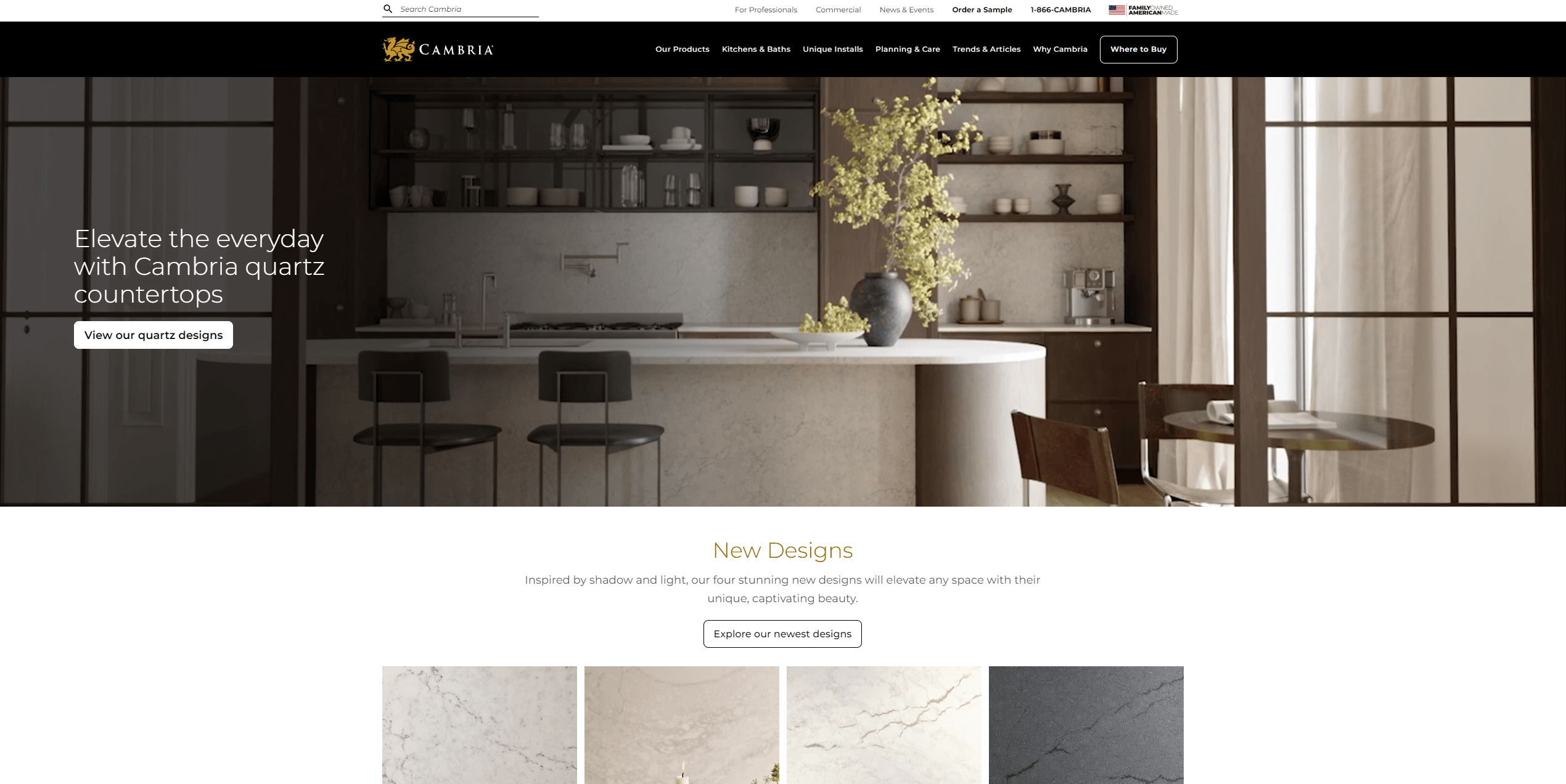
Source: Cambria
Simplicity and brevity are fundamental to creating an effective email signup form. Countertop companies can significantly improve completion rates by streamlining the process and eliminating unnecessary steps. Start by requesting only the most essential information—in most cases, this means just an email address. By focusing on what’s absolutely necessary, you reduce the likelihood of potential subscribers abandoning the form.
Additionally, ensure the form uses clear and concise field headers. For instance, straightforward labels like “Your Email” make the process intuitive and user-friendly. Avoid asking for optional details upfront; these can be gathered later during nurturing campaigns or customer interactions. Keeping the form short and removing barriers not only simplifies the user experience but also aligns with research showing that forms with fewer fields consistently achieve higher conversion rates.
2) Clear Indication of the Value of the Subscription
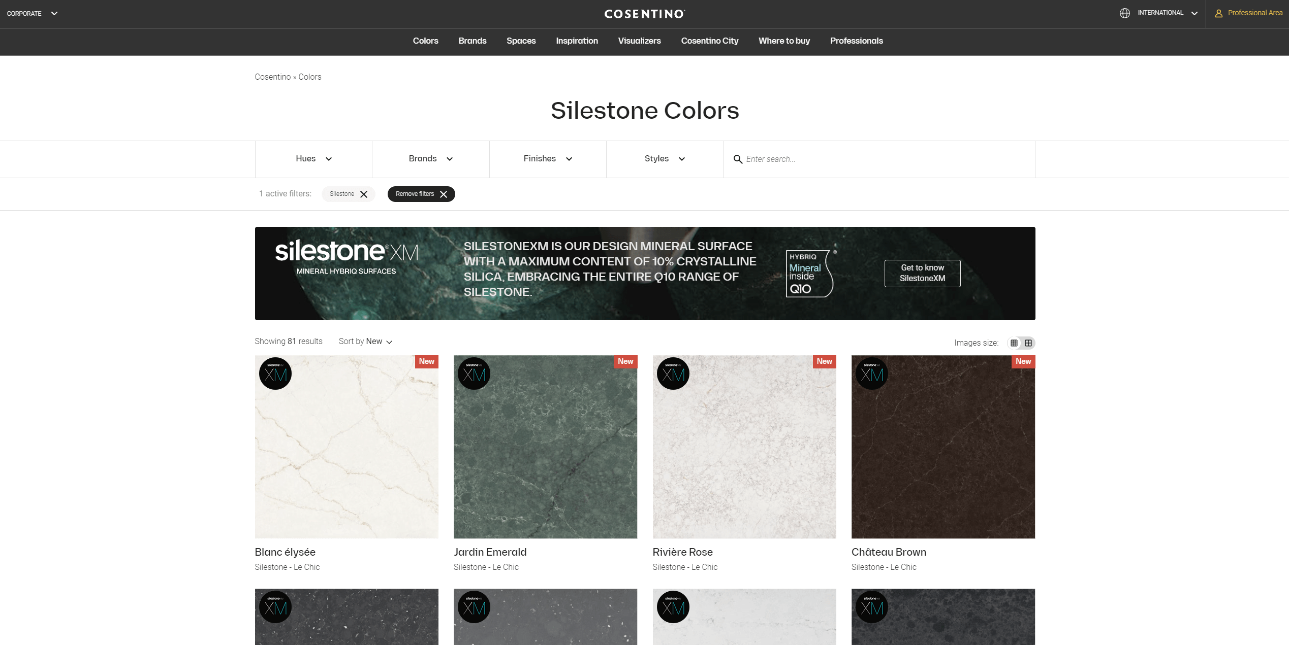
Source: Cosentino
People sign up when they see a direct benefit. For countertop companies, clearly communicating the value of your emails is crucial.
Highlight the Benefits
When designing your email signup form, emphasize the specific advantages your audience will receive. For instance, phrases like “Get exclusive countertop design tips” or “Access special discounts for your kitchen renovation” resonate well with potential subscribers. Make these benefits clear and concise so that users understand exactly what they’re signing up for.
Leverage Social Proof
Trust plays a vital role in convincing visitors to subscribe. Showcase testimonials or highlight the number of people who already trust your brand, such as “Join 10,000+ happy homeowners who receive our updates.” This reassures new subscribers that they are making a good choice.
-
Use measurable promises: Provide clear and actionable outcomes, such as “Save 15% on your first order.”
-
Showcase unique offers: If you’re providing a downloadable guide, coupon, or another special incentive, make sure to call it out directly on the form.
3) Thoughtful Design and Layout
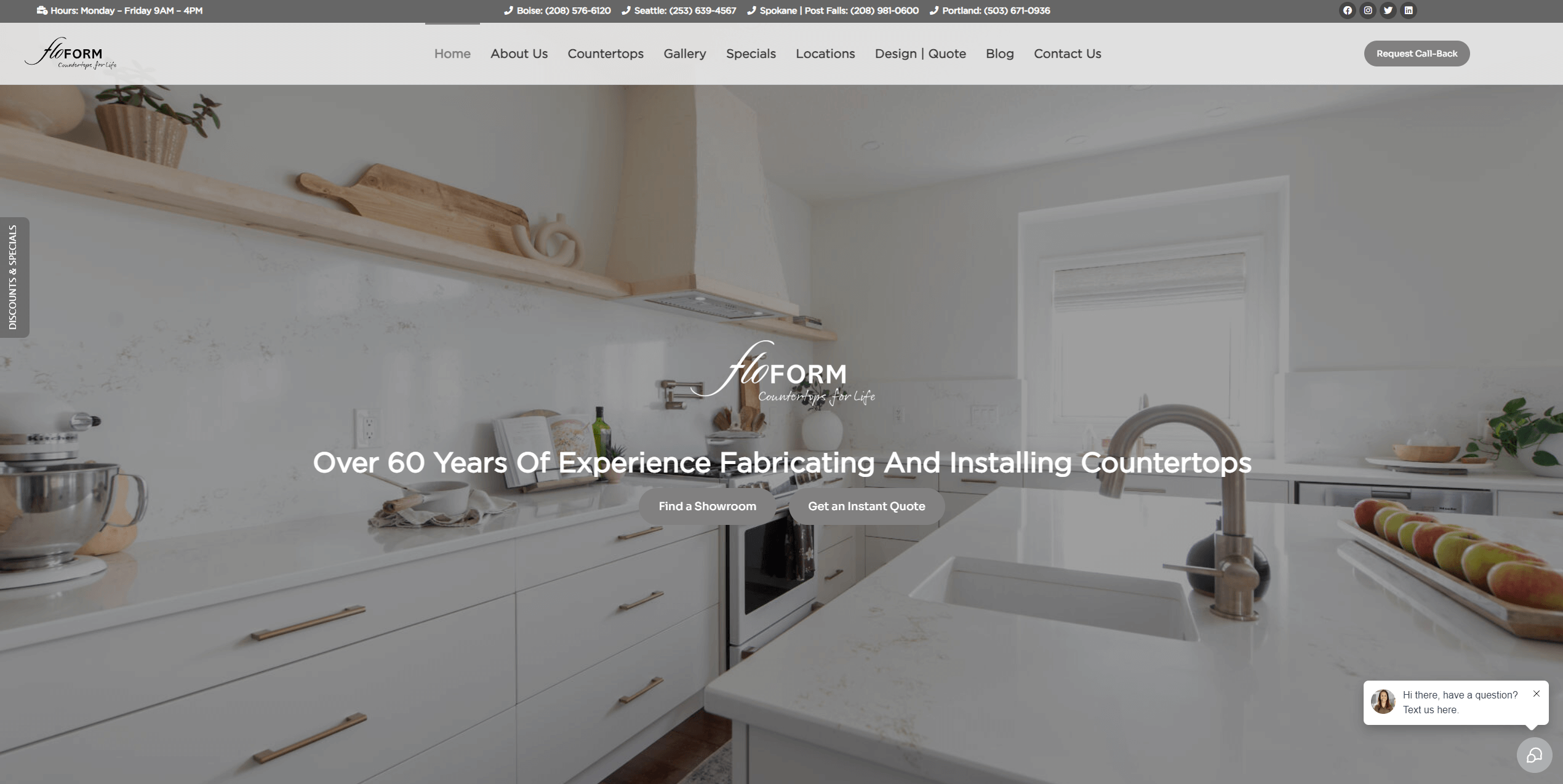
Source: Floform
An appealing, user-friendly design ensures that your form stands out and is easy to use. The design and layout of your email signup form are just as important as its content. A visually appealing form can capture attention and encourage more users to engage.
Use Contrasting Colors
Make your form pop by selecting colours that contrast with the rest of your website. A bold background or button colour can draw attention to the form, ensuring it doesn’t blend in with the surrounding content. For example, if your website predominantly uses neutral tones, consider a bright accent colour for the signup button to make it stand out.
Position Your Form Strategically
Where you place your signup form can significantly impact its visibility and effectiveness. Ideally, the form should be positioned above the fold on your homepage, ensuring that visitors see it without needing to scroll. Alternatively, placing the form in a prominent sidebar or using a timed pop-up can also capture attention effectively. Pop-ups, when timed appropriately, can draw focus without being intrusive.
-
Ensure responsiveness: As many users browse websites on mobile devices, your signup form must be optimized for seamless display on both mobile and desktop screens. Test the form to ensure it adjusts well to various screen sizes and remains easy to use on smaller devices.
With thoughtful design and strategic placement, your email signup form can effectively draw attention and encourage more users to join your list. A well-designed form speaks volumes about your brand’s professionalism and commitment to providing a positive user experience.
4) Calls to Action (CTA)
The call-to-action (CTA) button is a make-or-break element of your signup form. For countertop companies, crafting a compelling and visually striking CTA can significantly improve conversions by encouraging immediate action and drawing the user’s attention to the form’s ultimate purpose.
Use Action-Oriented Language
Strong, action-oriented verbs can make your CTA more compelling. Words like “Download,” “Get,” or “Join” prompt users to act right away. These verbs emphasize the benefit the user will receive and create a sense of direction. For instance, instead of a vague “Subscribe,” opt for something like “Get My Free Kitchen Design Guide,” which clearly outlines the value of signing up and personalizes the experience.
Create a Sense of Urgency
Adding an element of urgency can spur users to take action quickly. Phrases such as “Sign Up Today” or “Claim Your Exclusive Discount Now” can create a fear of missing out, motivating users to act immediately. Countertop companies offering limited-time deals or exclusive content should highlight these aspects prominently in their CTA.
Design for Visibility
The visual appeal of your CTA button plays a crucial role in its effectiveness. Use bold, contrasting colours to make the button stand out from the rest of the form and website. Ensure the button is large enough to grab attention but not so large that it feels overwhelming. The text on the button should also be easy to read, with sufficient whitespace around it to avoid clutter. Experimenting with shapes, borders, and shadow effects can add an extra layer of visual distinction.
A well-crafted CTA, combining effective wording and thoughtful design, ensures that potential subscribers feel both informed and motivated to engage with your email signup form.
5) Transparency and Trust
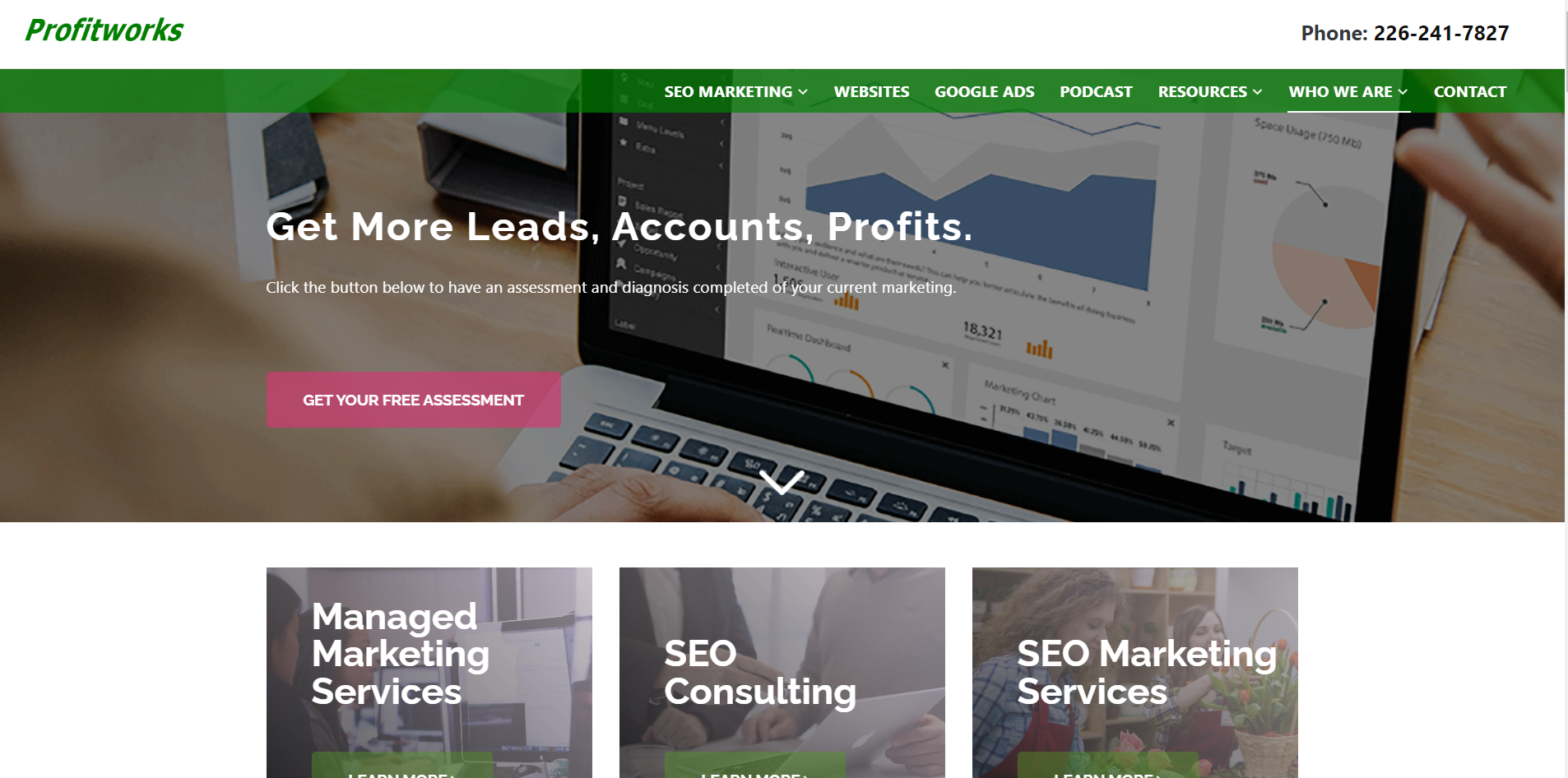
Source: Profitworks
Trust is critical in persuading users to share their information. For countertop companies, fostering transparency and reliability is essential to establishing confidence and encouraging signups. By addressing concerns and clearly outlining what users can expect, you can significantly improve your form’s effectiveness.
Display a Privacy Policy
A simple privacy statement can go a long way in reassuring potential subscribers. Include a brief note like, “We respect your privacy. No spam, ever,” to emphasize your commitment to safeguarding their information. Additionally, provide a link to your full privacy policy so users can review it in detail if desired. Being upfront about how their data will be used—and what they won’t receive—helps reduce hesitation.
Specify Email Frequency
Uncertainty about email frequency can deter potential subscribers. Clearly outline how often you’ll reach out, whether it’s “Monthly updates” or “Weekly deals.” This sets expectations and shows respect for their time and inboxes.
Provide Tailored Options
Empower users to customize their subscription preferences. Offer choices for the type of emails they’d like to receive, such as promotions, design tips, or event invitations. This not only improves user satisfaction but also increases the likelihood of engagement.
Add Credibility with Secure Practices
Show that your company is trustworthy by using a secure connection (SSL) and including clear contact details on your form. A secure connection icon, paired with an accessible way to reach your team, reassures users that they’re dealing with a legitimate business. Credibility is further strengthened when users see that their personal data is handled responsibly. Research shows that 46% of consumers are willing to pay more to trustworthy brands. Being transparent about your email newsletter can greatly increase user trust.
6) Optimization for Mobile Devices
With the growing number of users accessing websites via smartphones, it is crucial to ensure your email signup form is mobile-friendly. given the large share of mobile users a form that is not optimized for smaller screens can frustrate users and deter them from subscribing, leading to missed opportunities.
Design for Mobile Usability
Ensure that all input fields and buttons are large enough to be easily tappable on mobile devices. Users should not have to zoom in to click on a field or button. Additionally, pay attention to spacing between elements to prevent accidental clicks, which can frustrate users.
Enable Autocomplete and Keyboard Optimization
Streamline the signup process by enabling autocomplete features. This allows browsers to pre-fill fields like email addresses, saving time and reducing errors. Also, use appropriate keyboard types for different fields. For instance, displaying a numeric keypad for phone number fields improves usability.
Test Across Devices
Testing your form on various devices is vital to ensure it functions flawlessly. Check how it performs on both iOS and Android platforms, as well as across different screen sizes and orientations. Address any issues to provide a seamless experience for all users. A mobile-optimized form ensures you capture potential subscribers no matter how they access your site.
7) A/B Testing
To create the most effective email signup form, continuous testing is essential. Experiment with different elements to see what resonates best with your audience.
Test Individual Elements
Rather than overhauling the entire form, focus on testing one element at a time. For example, you can experiment with different headlines, CTA text, button colors, or form placements. This targeted approach makes it easier to pinpoint what changes drive improvements.
Analyze and Iterate
Use analytics tools to track the performance of each test. Compare metrics like conversion rates and engagement to identify the version that works best. Remember, trends and user preferences evolve over time, so regular testing ensures your signup form stays optimized and effective.
Keep Testing Fresh
Once you implement a winning version, start a new test. Continuous A/B testing allows you to refine your form over time, keeping it aligned with user expectations and industry best practices. With consistent effort, your form’s performance can continually improve, driving higher conversions.
8) Social Proof
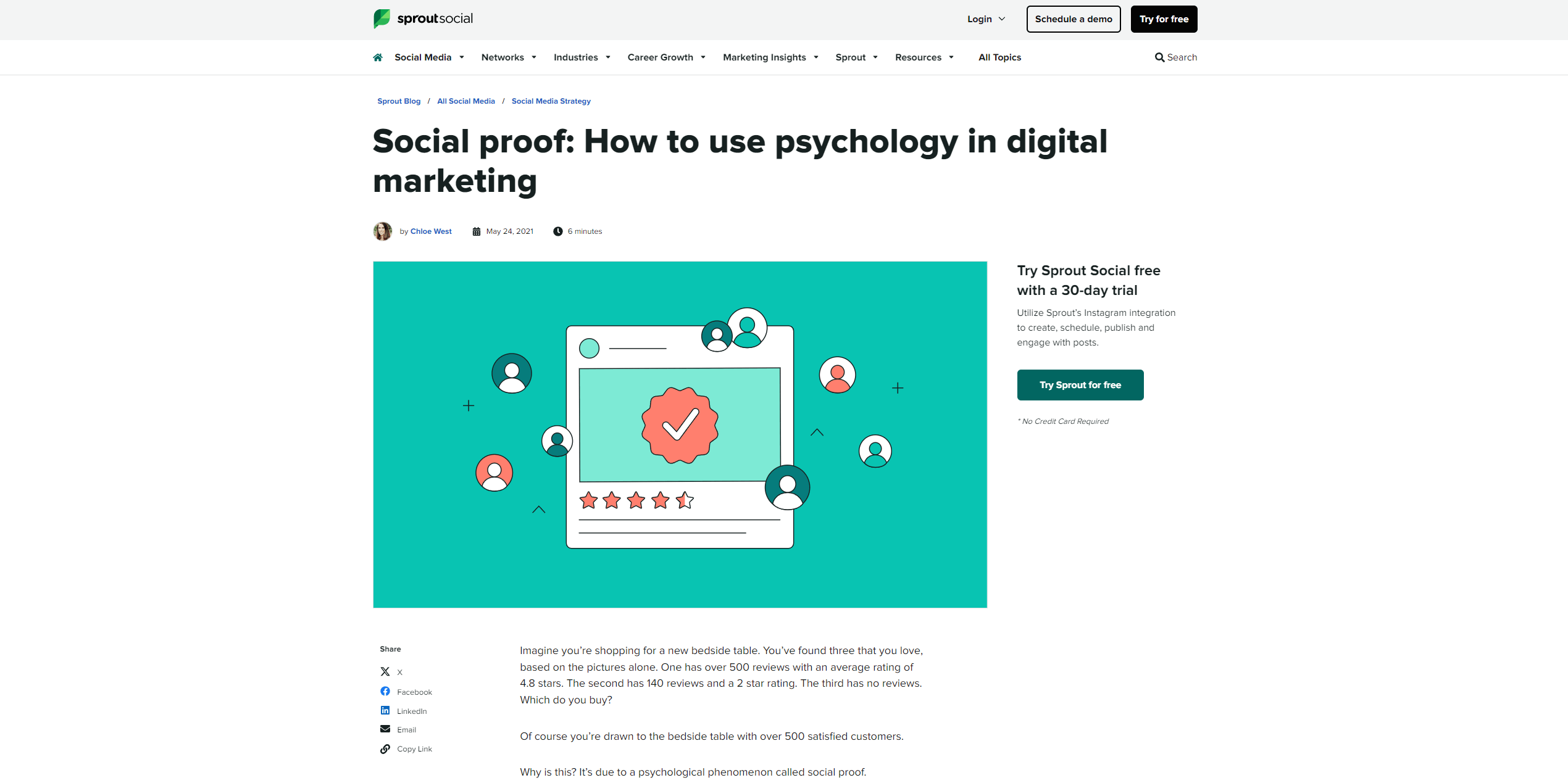
Source: Sproutsocial
Social proof is a powerful psychological phenomenon that drives people to trust the opinions and actions of others, especially when making decisions. Leveraging social proof elements in your subscription form can significantly boost its effectiveness by fostering trust and credibility.
Highlight Subscriber Numbers: If you’ve amassed a large audience, let potential subscribers know. For example, phrases like “Join 50,000+ readers who receive exclusive insights” create a sense of trust and belonging.
Incorporate Testimonials: Adding brief, positive testimonials from existing subscribers can help validate your value. A satisfied subscriber saying, “This newsletter transformed how I approach [your topic]” can reassure potential readers of your credibility.
Showcase Client and Partner Logos: If you work with recognized brands or organizations, their logos act as endorsements. Displaying logos like “Trusted by [Big Client Name]” conveys professionalism and reliability.
Feature Media Mentions: Being featured in reputable media outlets? Include their logos with phrases like “As seen in [Publication Name].” This positions your brand as credible and noteworthy.
Display Certifications and Awards: If you’ve received industry recognition, certifications, or awards, don’t shy away from showing them off. Accolades indicate expertise and elevate your authority.
Leverage Social Media Metrics: Highlight how your content performs on social platforms, such as “10,000+ shares on social media,” to demonstrate its popularity and value.
Integrating these elements strategically into your subscription form can transform it into a trust-building tool, helping convert visitors into loyal subscribers.