Effective Email Templates - Does Putting Images On The Left Or Right Side Improve Results
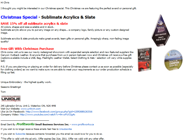
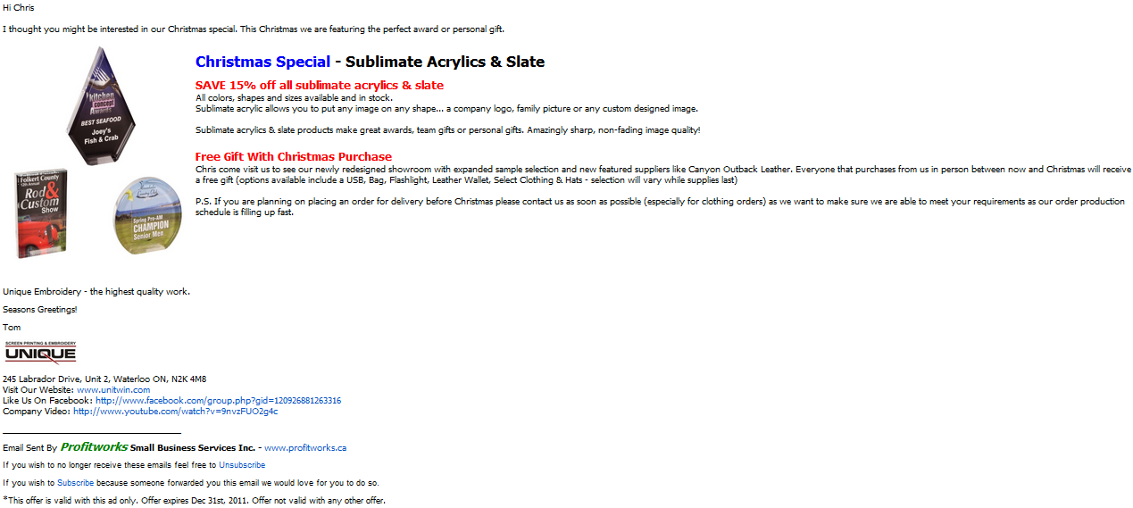
In my ongoing efforts to improve my email marketing skills for my clients and my own business I continue to test new ideas. About a month ago I tested an interesting idea. The idea was to see what kind of an impact the location of graphics has on results, specifically open rate, click through rate, reads per 100 emails sent and clicks per 100 emails sent. I really enjoy testing and improving my email tactics as I love analyzing data and email marketing is one of the easiest marketing methods to get data for. When you think about it, it is really amazing how much data you can get from email marketing. Enough about my love of email data. Here are the results from my test.
Before I get to the test I should probably explain what it is I was sending. I was sending a marketing email to a list of customers and prospects for my client Unique Embroidery who provides promotion items. Basically if you need anything with a logo on it (shirts, hats, pens, mugs, trophies, USB keys etc) they can do it. There list is just under 2,000 recipients so I sent the one version of the email to half the list, and the other version of the email to the other half of the list.
Here is a quick video summary of the test and the results if you like watching videos instead of reading. For those that enjoy reading more than watching videos, continue reading below. If you are not familiar with what any of the terms in this video or article mean, check our marketing terms dictionary.
To Leave a comment for this video go to Youtube.com
You can find more videos related to getting more customers on Profitworks' Youtube Channel.
The Two Different Email Newsletter Designs
Option #1 - Image on the right side

Option #2 - Image on the left side

The Controls
- each newsletter was sent with the same subject line "Christmas deal - Unique Embroidery" or for the prospects a subject line of "Improve employee productivity - Unique Embroidery"
- each newsletter had the same from line
- the newsletter was sent at three different times, for each time is was sent one copy of each version was sent to have of the recipients I was sending to at that time
- each newsletter was sent from the same email server
- all versions included the same number of links and had links in the same location
The Results
Option #1 - Image on the right side
Open Rate = 20.2%
Reads Per 100 Emails Sent = 20.2
Click Through Rate On Emails Sent = 0.4%
Clicks Per 100 Emails Sent = 0.5
Click Through Rate On Emails Opened = 2.0%
Unsubscribe Rate = 1.1%
Option #2 - Image on the left side
Open Rate = 20.8% (Better than Option #1)
Reads Per 100 Emails Sent = 20.8 (Better than Option #1)
Click Through Rate On Emails Sent = 0.9% (Better than Option #1)
Clicks Per 100 Emails Sent = 0.9 (Better than Option #1)
Click Through Rate On Emails Opened = 4.3% (Better than Option #1)
Unsubscribe Rate = 0.7% (Better than Option #1)

The Winner = Option #2 - Image On The Left Side.
The image on the left beat the image on the left version but only by a small margin for most metrics. Based on these results moving your graphics to the left instead of the right will yield better results. This kind of makes sense as people read from left to right and images are used to attract the eye, and then after attracting the eye people will me more inclined to read. After doing this test I also realized I have some work to do on subject lines and link placement for this newsletter as the open rates and click through rates are not nearly as high as some of my other campaigns. I guess I will need to continue to do some testing on this newsletter to get the results up to where they could be. Lets be honest though, I will continue to test new things even if I had outstanding results. I feel there is always room for improvement.
If you are a business that does not use email marketing I would highly recommend you take advantage of this tool. It can be a great marketing tool and is often referred to as the top return on investment marketing initiative for businesses. If you don't know where to start sign up for Aweber orConstant Contact. Both systems are low cost, easy to learn and very effective to use. I think Aweber also has an offer on right now where you can sign up for $1 for a one month trial. Forwebsites built on Joomlathe email marketing programAcymailing is also a great option.
Other Related Articles You Might Be Interested In
1. Email Marketing - See the complete list of articles related to email marketing
4. Best Email Marketing Newsletter Design To Optimize Click Through Rates
My name is Chris R. Keller. I work at Profitworks Small Business Services helping various business to business small businesses in Waterloo and Kitchener Ontario generate new customers. Feel free to connect with me on Google+ or if you are just interested in getting new customers for your B2B small businesses enter your email in the box provided below and click the "Send Me Free Updates" button.
I hope you have enjoyed this on how to design the most effective email templates. If you liked this article please be sure to share it on Facebook, Linkedin, Twitter, Google+ or any social media network you are on. As always I love to feature guest posts on my blog so if you have an idea for an article send me a note.
